Design for dummies

Hey Terry I hope you find this post interesting.
Well I will try to make an study in composition trying to attack different aspects from traces, design, even symbology.
Before starting there are some things you have to understand When you want to design something.
1.-Firstable that there are not rules what it works for you sometimes it doesn`t work for others, but the main idea of a good design is to be humble and agree that you can know but not the totality.
2.-The best rule for designing is to follow your INTUITION that means that some people have the skill and talent to make powerful designs without knowing all the process of the different approaches you can have by studying the rules. Intution in fact is the greatest way to design.
3.-One of the points of the section is to give my approach, I am not tellling you have to follow the same scheme when you need to draw or design, but I know that the more you know the more you can free yourself.
4.-The point is to enjoy drawing and also enjoy the happy accidents you can have when you are designing, not all the designs are powerful but can be effective, you can see that with the work of Warhol all the power comes to the conception of the image and the usage of colors that impact you, but that is another theme.
5.-There are many ways to have a powerful design remember that art is so subjective so We are talking about emotions, some artists want to provoke a reaction good or bad, that reaction is the link that makes us agree that a person in doing art.
Research is the main key.
Before doing a design you have to have all the elements you want to use.
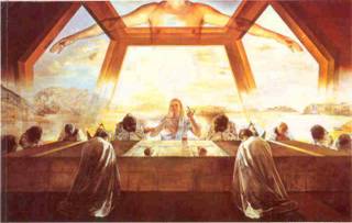
Last Supper by Dali.
Previous information neccesary to understand the behind the scenes about an artist (I have to say that some of these artists are so talented that the above rules never apply, is just the talent they have), one of this beautiful examples is the Art of Dali.
I really respect the work of Dali because is one of the few examples where from an Academic school started to draw and paint with more liberty getting into the surrealism, so the key is to have the elements to free yourself.
This painting from Dali is a watercolor done In cotton paper if I am right.
As you can see there is a torso as a representation of God, some few people know that as many artists Dali use real posing people or photo referenced guides, in fact the torso presented in the painting is in fact the torso of the same Dali when he was young, remember that Dali was an athletic boy that also started experimenting a lot in all the ways.
As you can see the Christ in the scene is without beard, one of the reasons is that in his point of view and I dare a little when I say that his religion stablished no beard for religious images.Did you know that in fact the face that was used as the model for Christ is not a man and that in reality it is a girl?, Dali always played with the androginy type and conception (Coco Channel is the main reference for that movement that started in Germany,France and Italy in the earliest 1910`s and a little before), and the oddest part is that is the girl shown was in fact his own wife, so in his ironic way of thinking is telling us that for him his own God is his wife, quite iroinic, isn`t it?.
Did you know that Dali was a better writer than an artist?.
Dali is also one fo the first creatives producing publicity in Spain, in fact composed some of the most funniest gingles ever!.
Also Dali produced work for Disney.
Have a great day and I will continue with the study little by little, but firstable I wanted to give and overall so you can understand the really samrt guy that Dali was.
No comments:
Post a Comment